Charts
Data presented in table form (rows and columns) can be difficult to read and understand, making it difficult to draw meaningful insights from it. Visualizations are a great way to take the results of a Query and present the information in a more easily digestible and visual way. By creating visualizations, you can begin to tell a story with your data and make sense of the numbers and data points that may otherwise be scattered across a table or multiple tables. With ZettaBlock’s Visualizations, you can quickly and effortlessly transform your data from extensive tables to easily-readable charts. This makes it simpler to draw insights from the data and communicate it effectively with others (such as by sharing your dashboards with the rest of the community!).
Charts are a feature that allows you to add and edit visualizations. In this user manual, you will find out how to use the key features of TABLE CHART and BAR CHART. The other supported types include Line Chart, Scatter Chart, Area Chart and Big Numbers. More chart types are coming soon.
Common Options
Below is a description of the most common options across multiple chart types.
1. Chart Naming
You can rename the chart by editing the Name bar under Chart options.
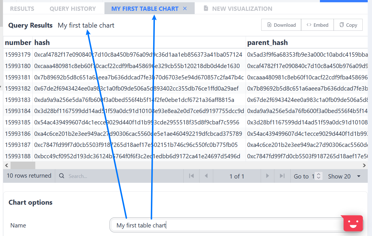
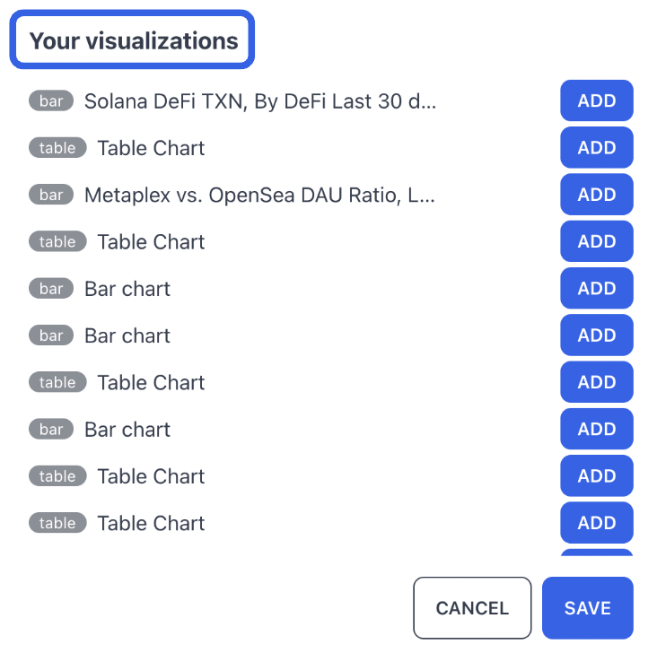
Please note that naming your chart is key if you want to ADD your visualization to the dashboard, as it assigns a human-recognizable identifier to your visualization. To learn more about the Dashboards feature, you can refer to Dashboards.
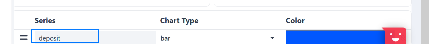
2. Column / Axis / Series Naming
To name a column / series, just type in the desired name in the Name box, as shown below. Note that this can also be done by modifying the SQL query with an AS clause.
3. Show Chart Legend
You can turn on the Show Chart Legend so people can see the column names.
4. Change the Color
The default chart color is blue, but you can choose different colors based on your preferences.
5. Embedding
Instead of using static screenshots in varying forms of quality, ZettaBlock has a native EMBED function that works across most platforms to share your visualizations. Clicking on the EMBED blue button will copy a link to your clipboard. You can then use this link to embed the visualization on your website.
Tables
1. Search, Go to, and Page View
The Search, Go to, and Page View functions in the Table Chart work the same as on the dashboard. These three functions can help you to locate specific rows of interest.
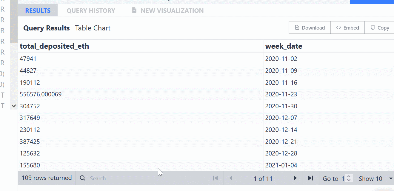
The Search function is useful when searching for certain information like wallet address or date. You can easily see all the rows that contain that information.
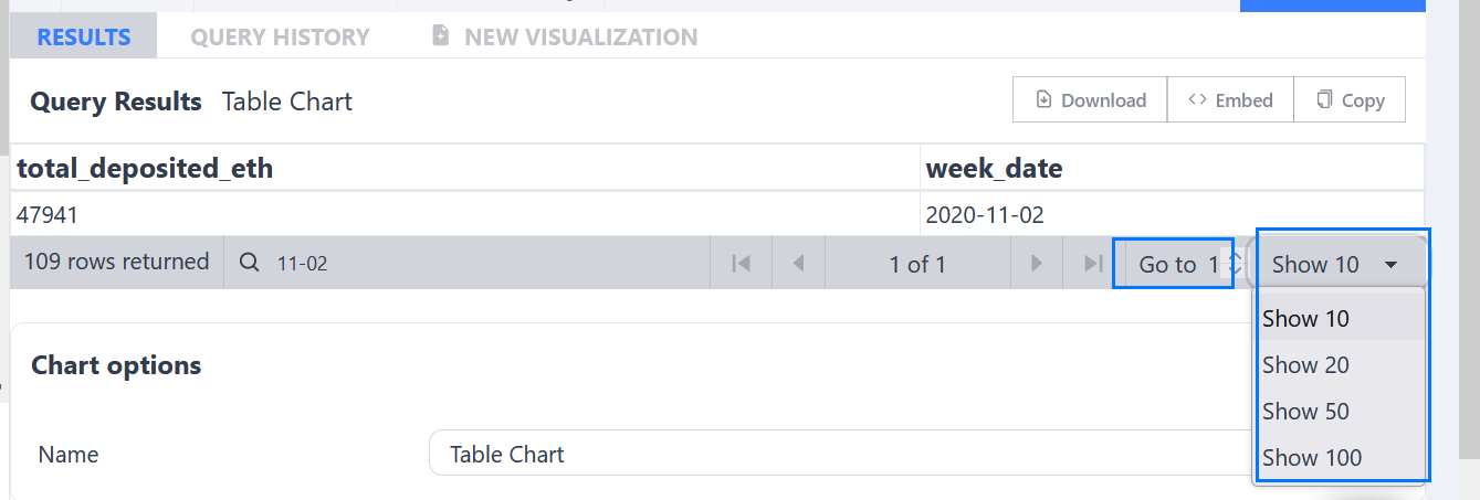
You can choose which page you want to see by changing the number in Go to bar.
You can also choose how many rows to display per page, ranging from 10 to 50.
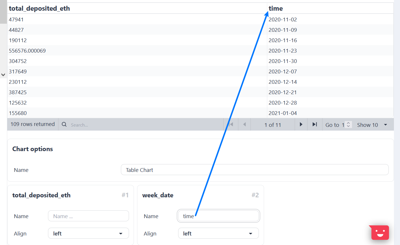
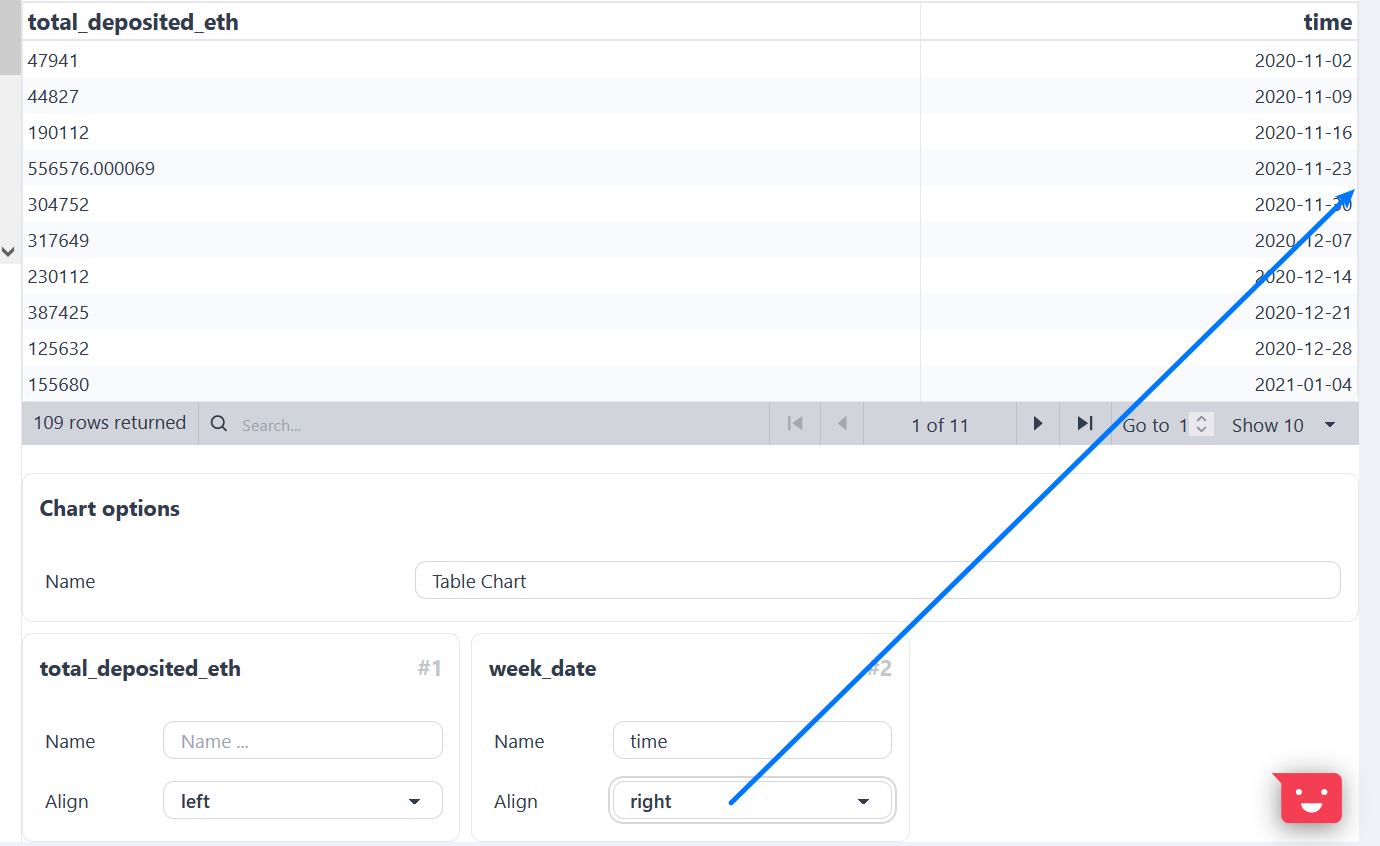
2. Change the Alignment
To change the text alignment of a column, simply click the Align drop down box and select the desired format.
Bar Charts
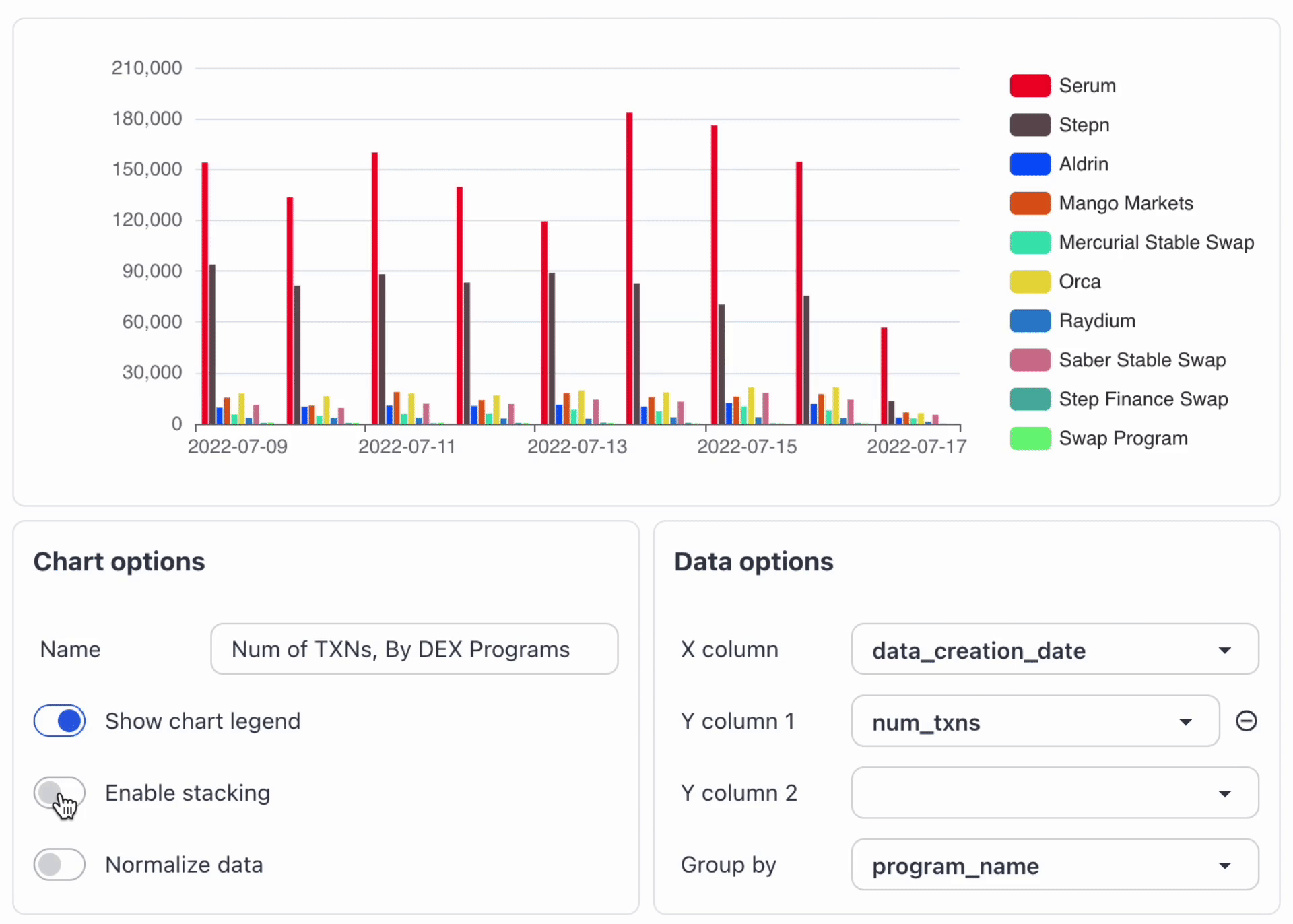
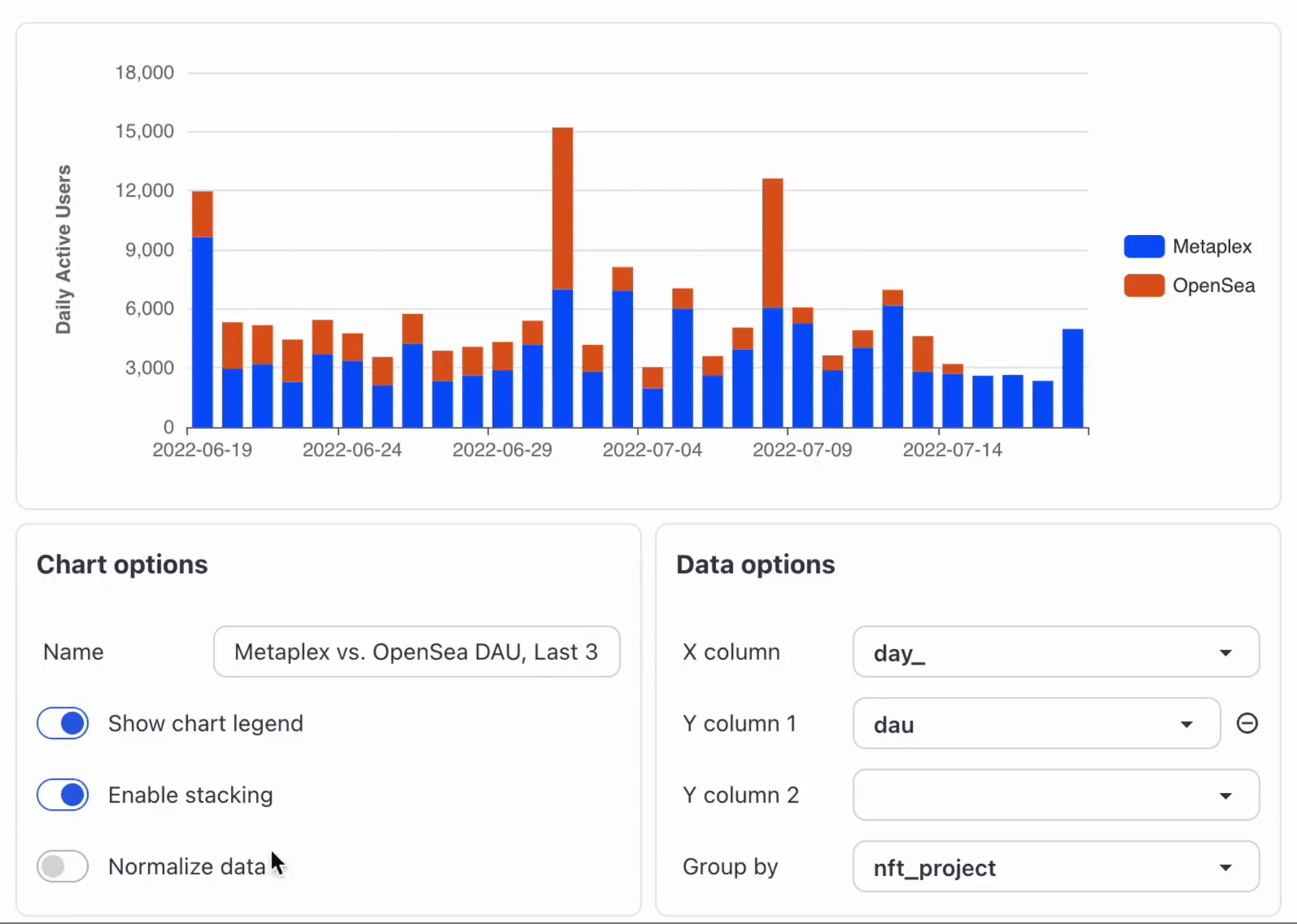
1. Enable Stacking
Enabling stacking makes it easier for you to visualize the data difference among categories.
2. Normalize Data
When you want to compare the ratios across different categories, you can use the Normalize data function.
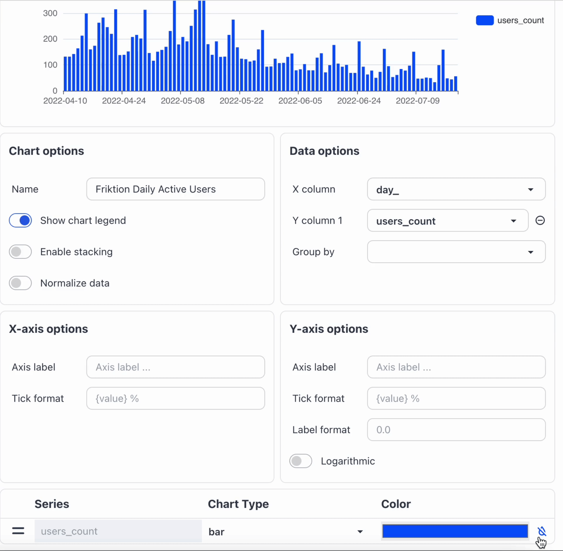
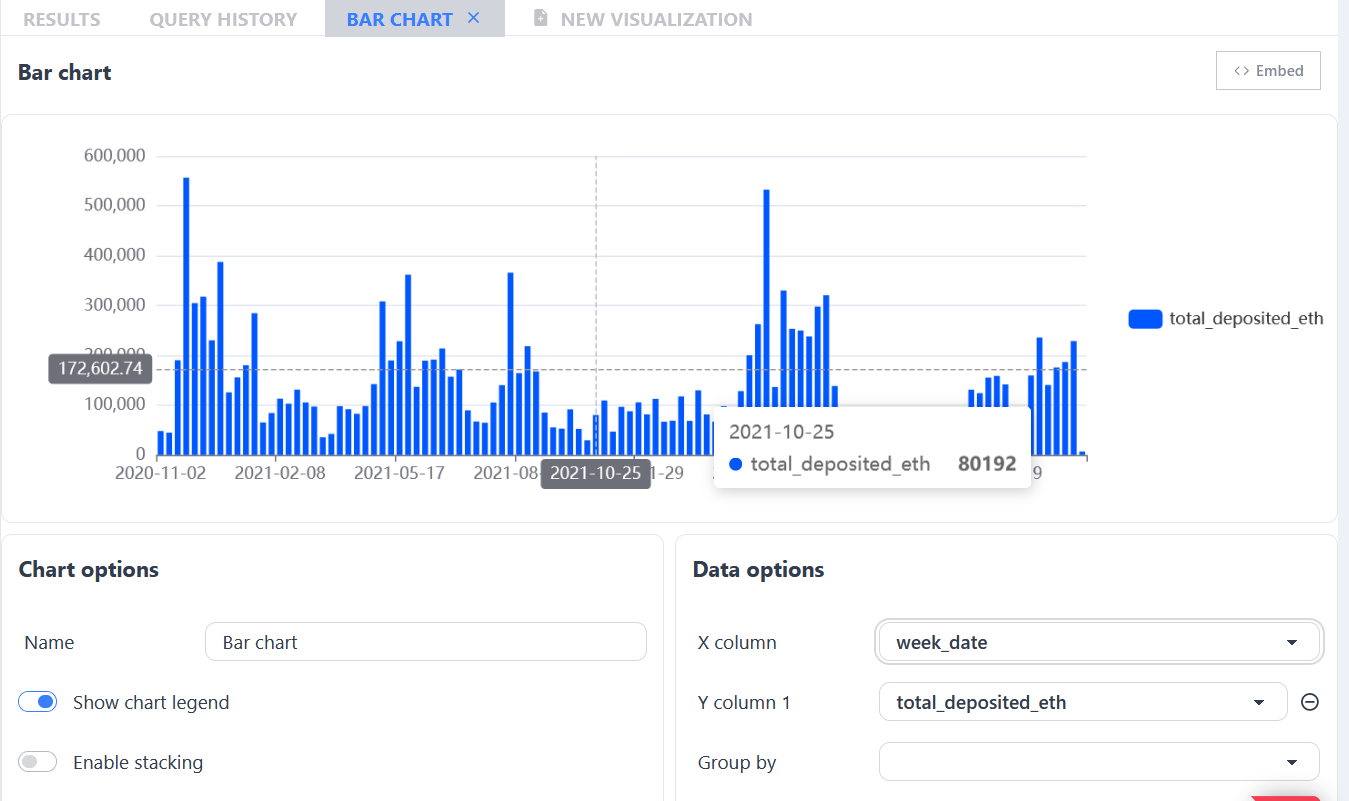
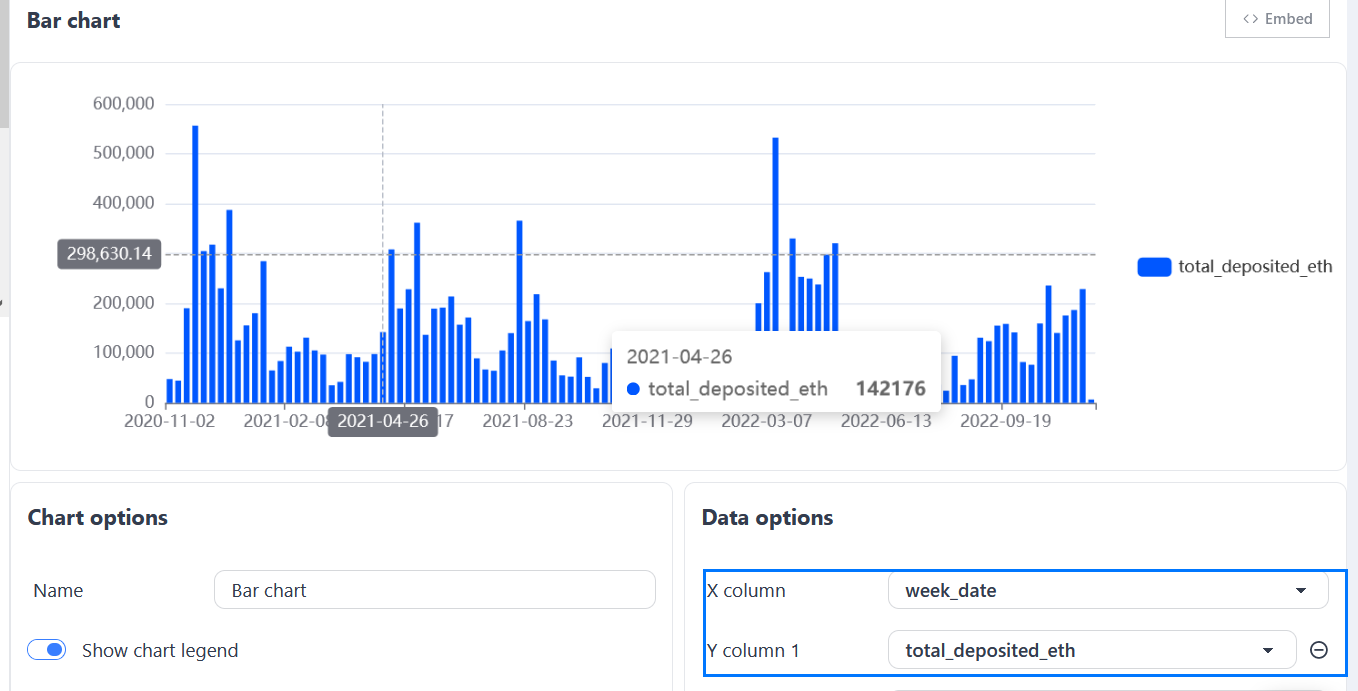
3. Choose X column/ Y column
Choosing the columns to be plotted is easy. Just select them from the Data options menu.
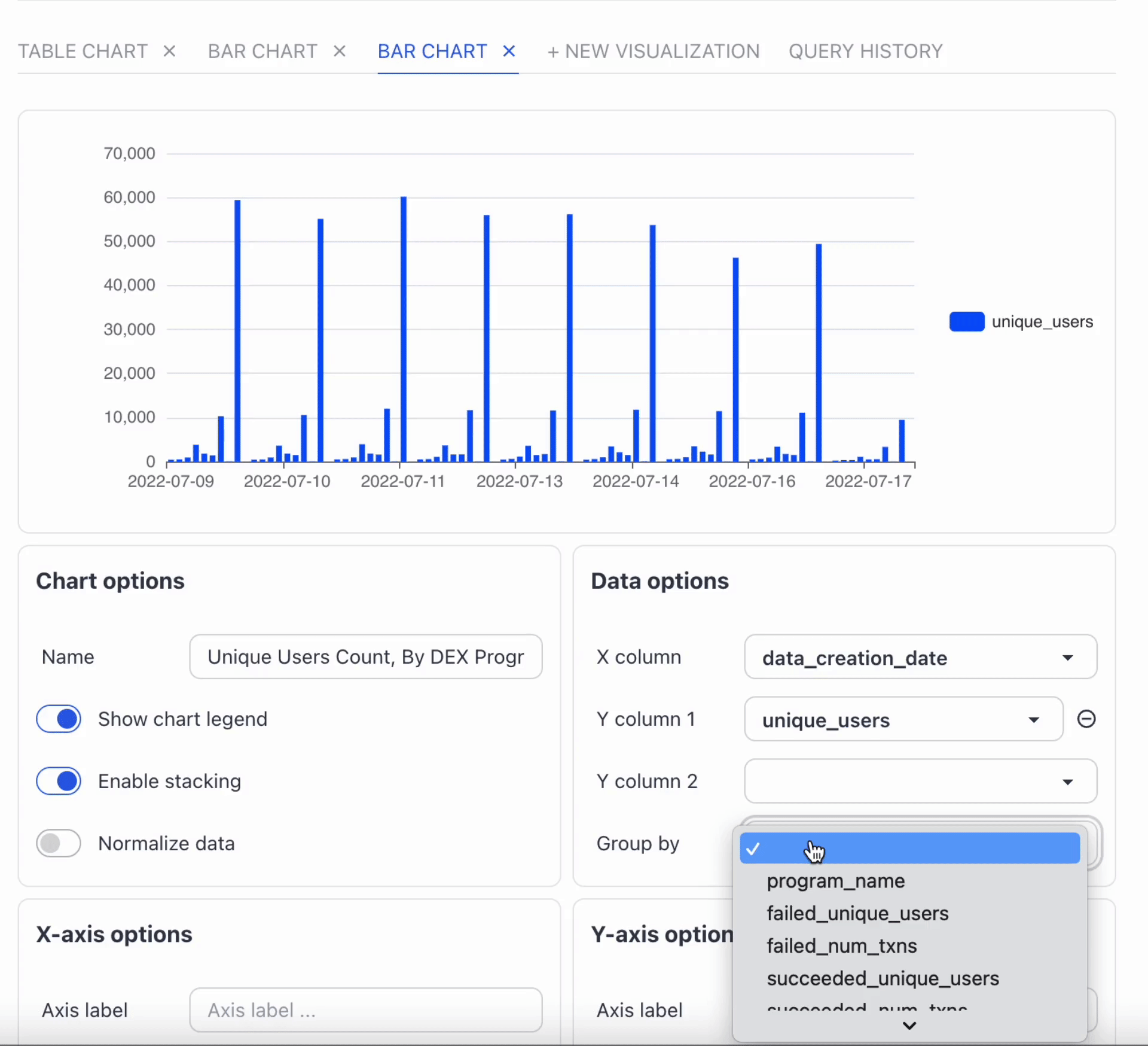
4. Group by
We cannot see the number of unique users per program by looking at the normal bar chart. For this, we need to group the data by program name. With the group by function, we can see the difference in the number of unique users per program. Note that this can also be done by modifying the SQL query with a GROUP BY clause.
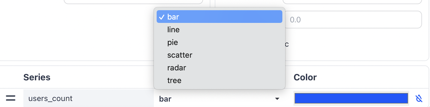
5. Chart Type
You can change the Chart Type from bar to line, pie, scatter, radar, and tree based on your preferences.